Claire Kimpe - Management
Fabrice Desbrez - Press relations
Baptiste M. Homo - Additional arrangement
Studio Volume - Digital Communication
Marjorie Risacher - Stage coaching
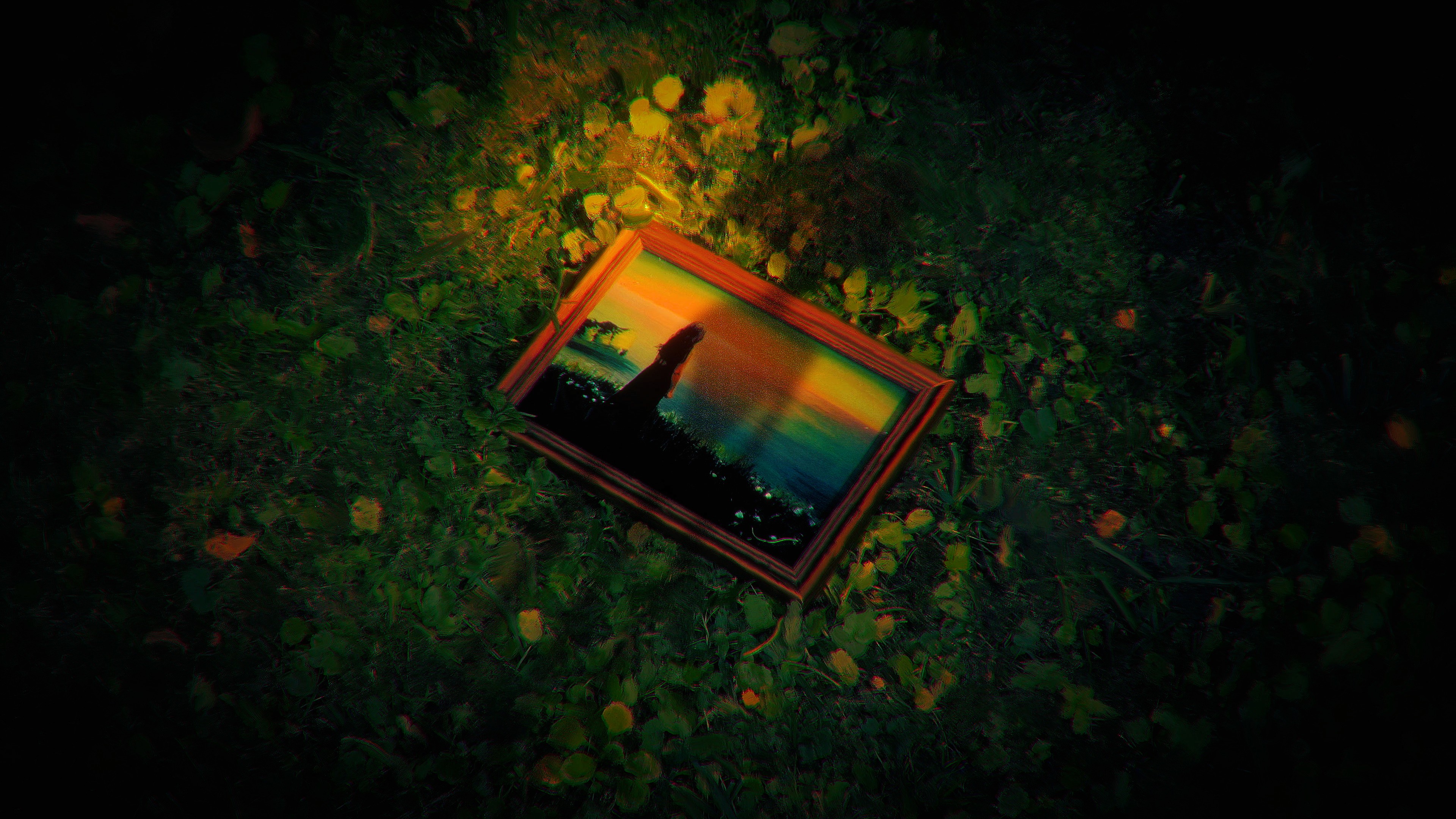
From Out There is the first project by Sandrøse Studio. Conceived as a transmedia work, it lays the foundations of a singular artistic universe where music dialogues with a visual narrative (graphic design, imagery, editorial content). Envisioned as an immersive experience, the project blends electronic pop with a surrealist aesthetic, all built around an imaginary place and a multi-layered narrative.
Responsibilities
The entire project and all associated assets were created by me.
Creation of a total artistic universe
Out There is the name of the imaginary place that serves as the foundation for the entire artistic project. It redefines the format of a musical project: instead of being solely embodied by the artist's image, a narrative space becomes central, unfolding through various elements: story, colors, emotions, lore, message… Image and sound then come together to depict and bear witness to the artist's passage through this dreamlike setting.
Ideation and research phase
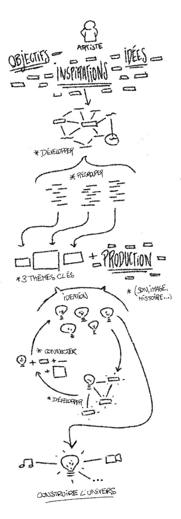
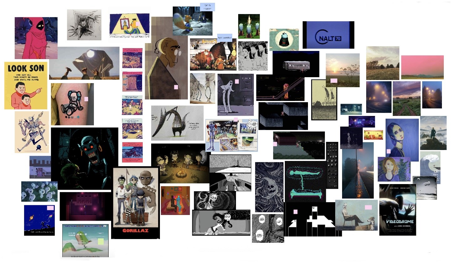
A long phase of research and experimentation was necessary to achieve the desired ambition: creating several moodboards, analyzing my references, writing narratives, storyboards... This phase was built as a funnel process: starting with a very broad material, then progressively refining it down to the key points that make the project coherent. The objective was to understand, with the greatest possible precision, what made a work fascinate me.
From this research emerged a central notion: contrast. Giving the artwork a dimension that is both soothing and terrifying, reassuring and unsettling. It is a tension that has always intrigued me, and which has tinted the universes that have left an impression on me. Several themes naturally embodied this idea: solitude, nostalgia, and nature. Three terms that played a key role in the creative process.
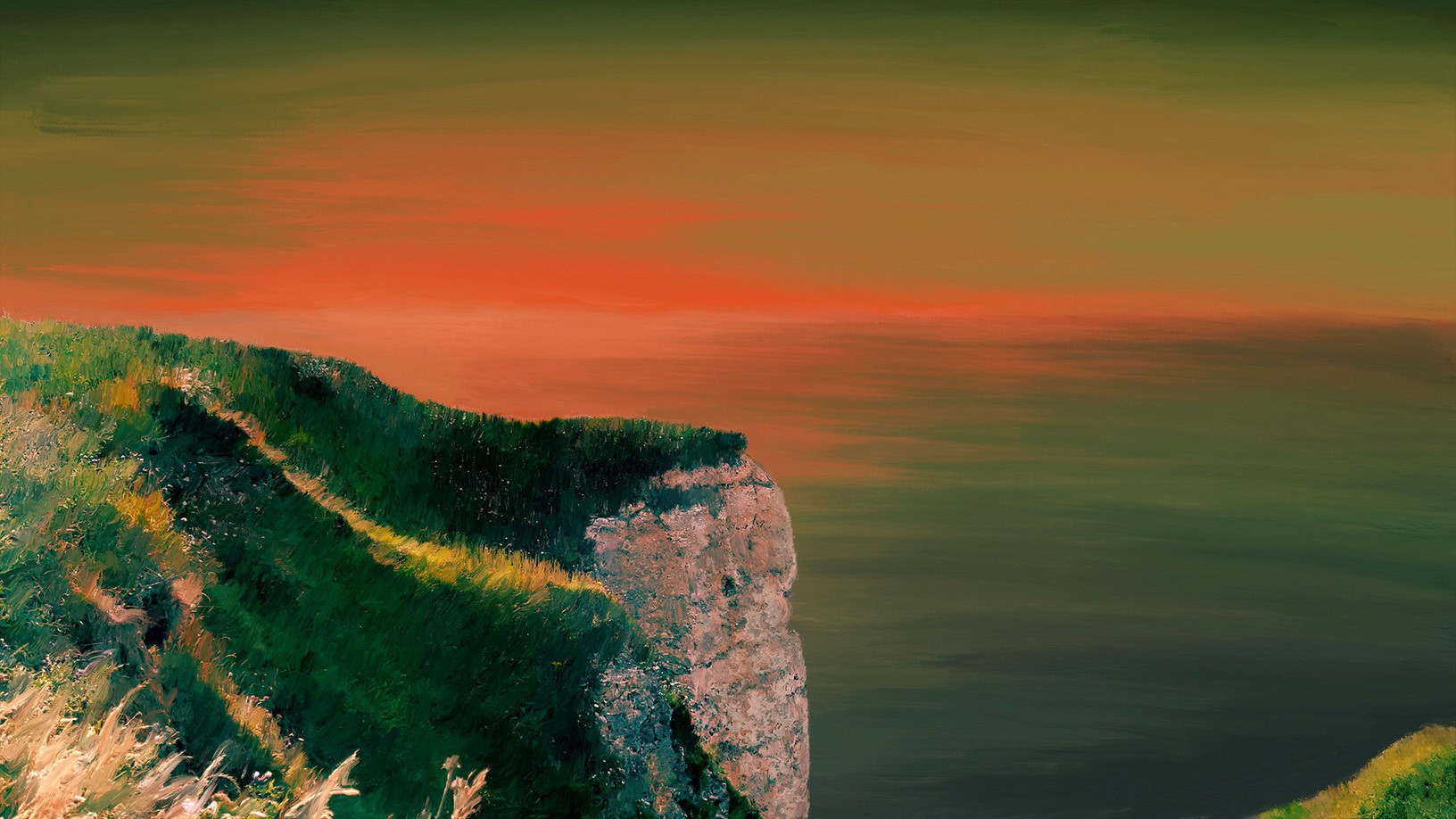
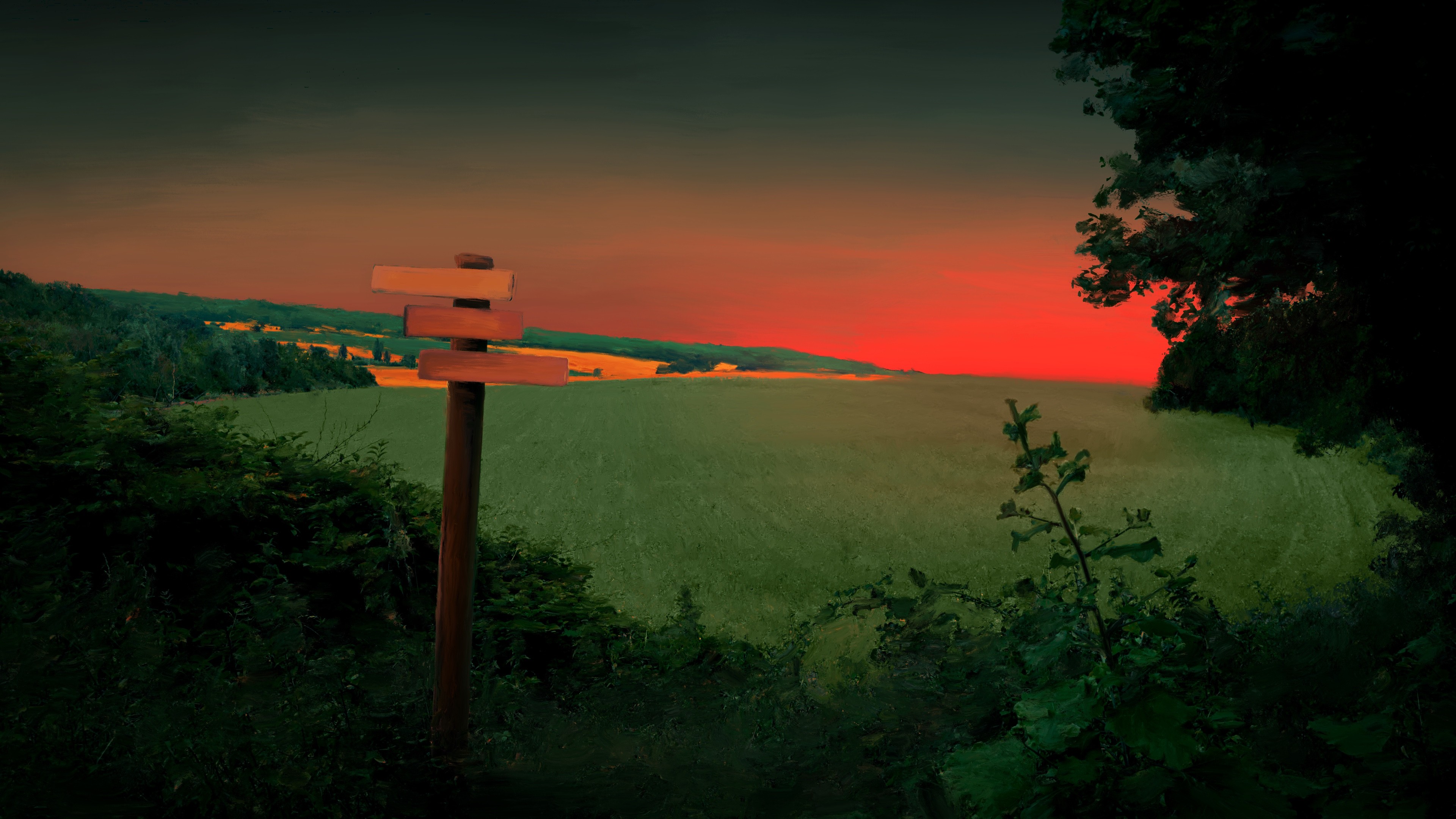
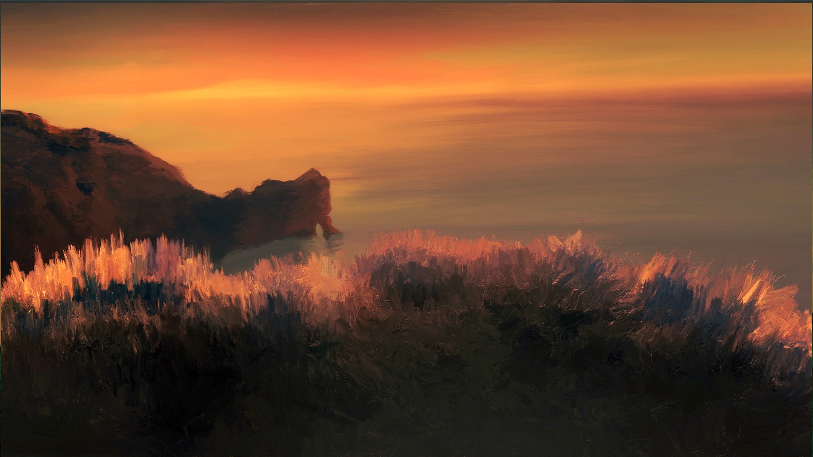
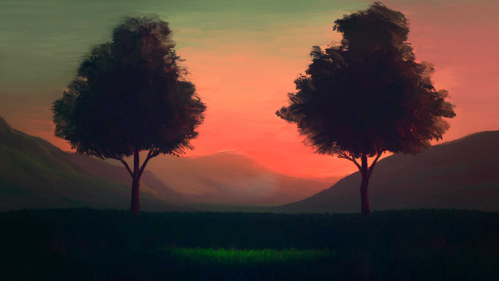
Setting up a setting that makes sense
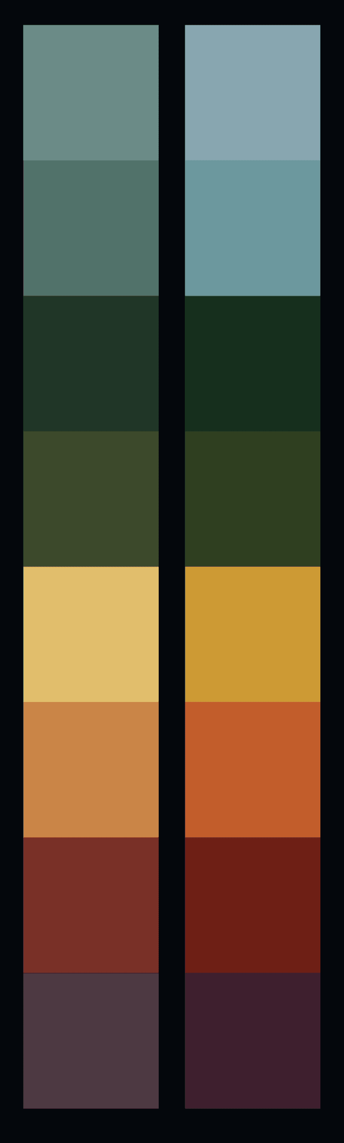
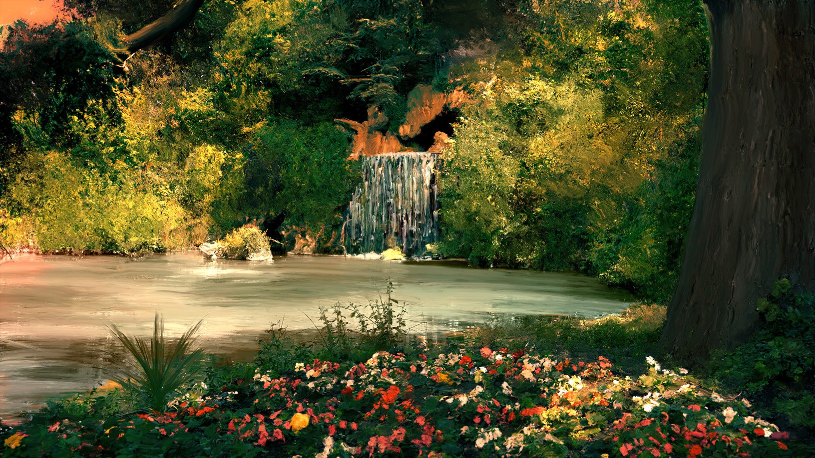
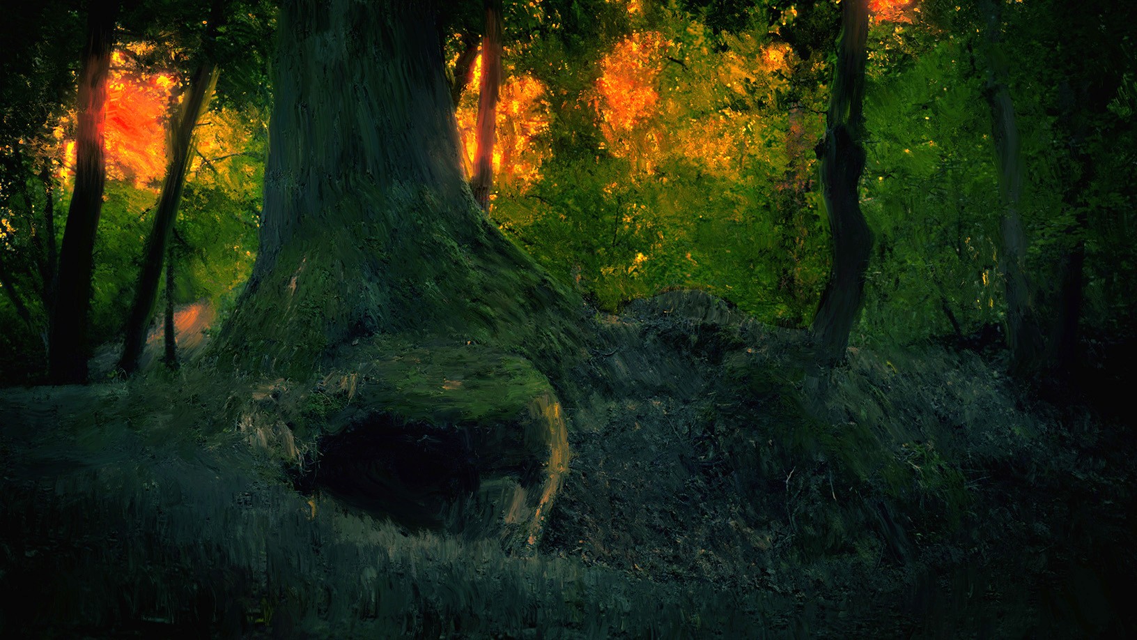
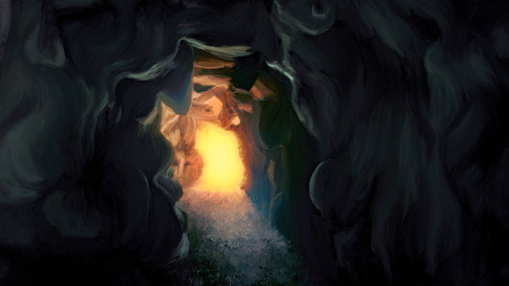
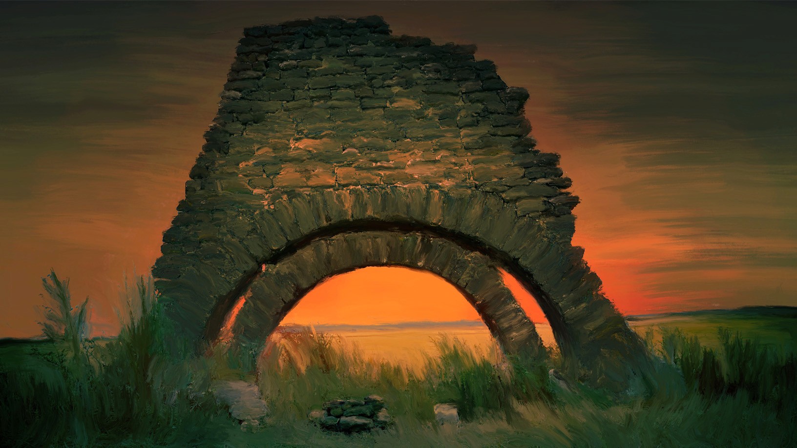
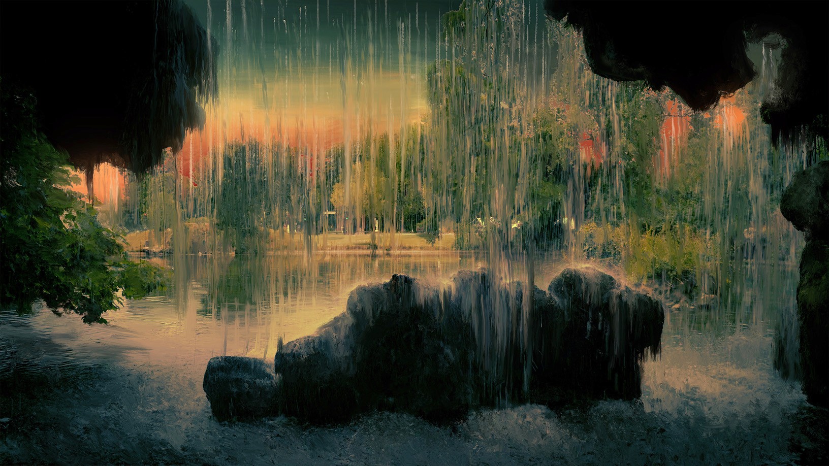
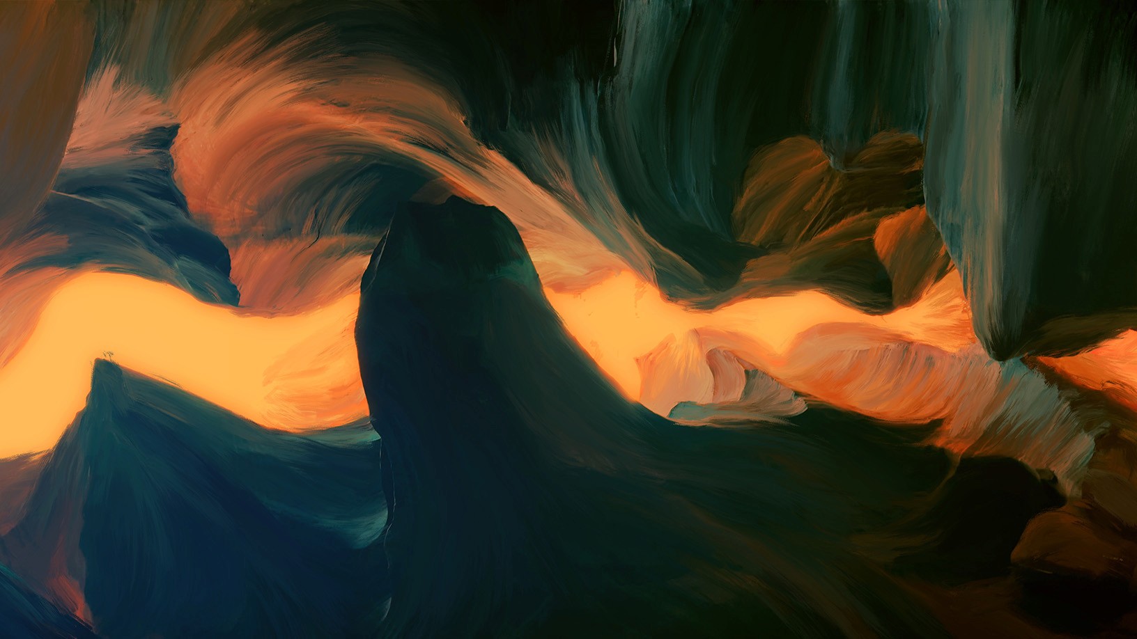
To build the set, its colors, and its atmosphere, I started with a childhood memory. To get to school, I would wake up at dawn and walk about ten minutes to my bus stop. I remember that quiet atmosphere, that thick cold, and the misty light of a day barely begun. There was something peaceful, yet at the same time anxious, in those suspended moments.
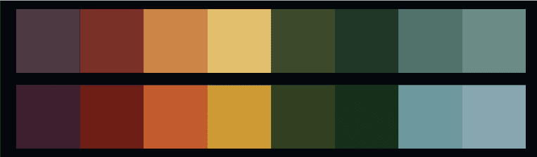
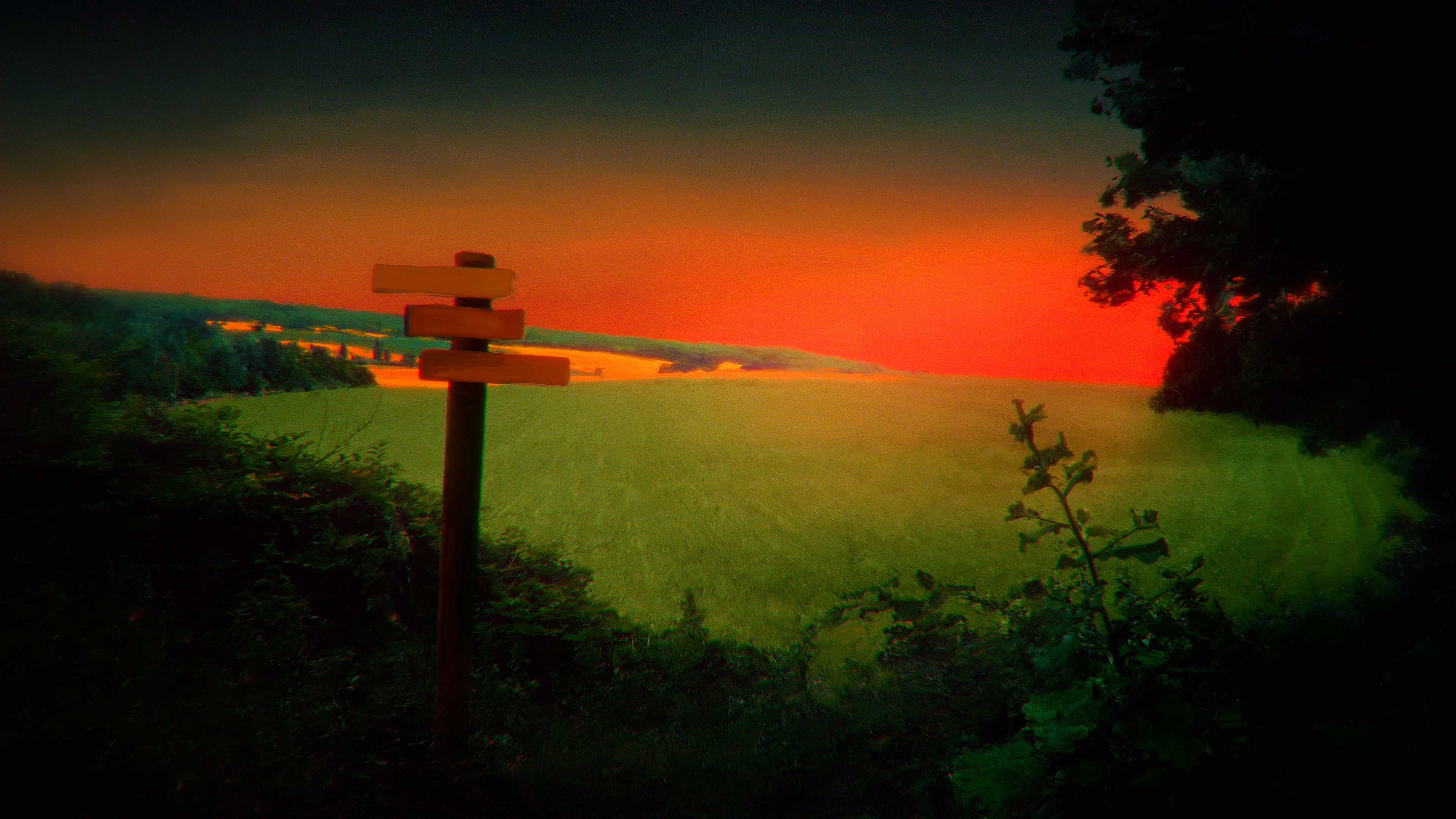
I designed Out There to evoke this feeling. This allowed me to define a precise color code and develop an original post-production process: transforming real locations into moving paintings. This treatment gives the scenery a frozen look, a touch of nostalgia and melancholy, and an atypical aesthetic.
The final touch: the Jims
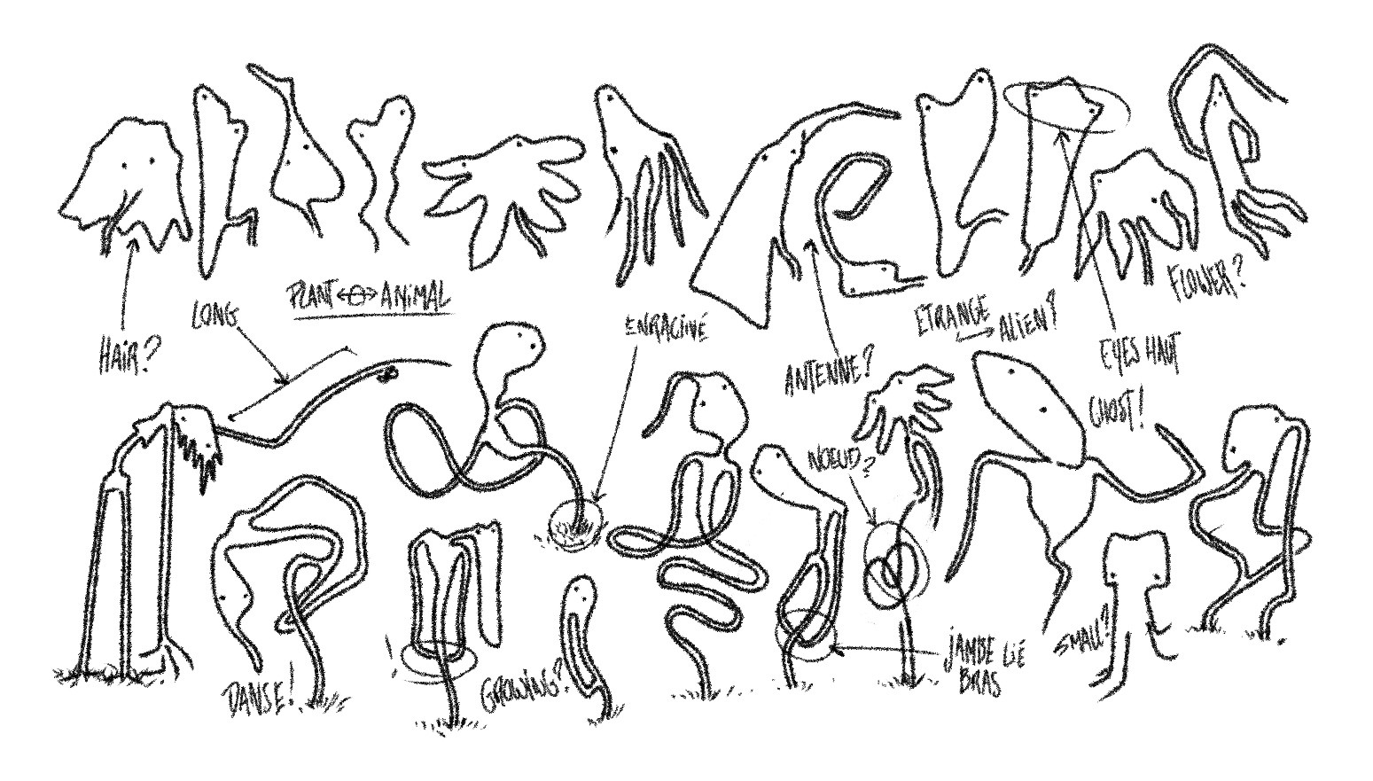
Ultimately, I knew this place had to be embodied by personified figures, in order to create a more vibrant and evocative landscape for the audience. So, I created these mysterious entities: les Jims. Their existence suggests a lore and a story: what are they? Where do they come from? These are questions that reinforce the strangeness and mystery, with answers gradually revealed through the visuals, music videos, and music.
Music with a unique aesthetic
The music intentionally sits on the border between the soundtrack of this universe and accessible pop. This required precise sound sculpting work: textures, retro synthesizers, cinematic progression, and ambient elements, to create total consistency with the visual identity. In parallel, a pop structure, magnetic vocals, and a dancing groove allow the music to remain central and live fully in a live format.
After several singles, an EP crystallized this process and offered it in a concrete form.
Storytelling through imagery
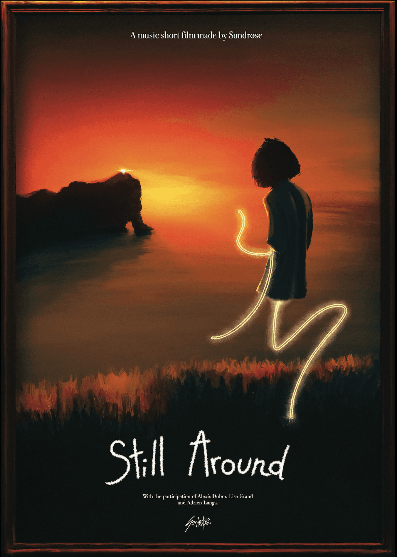
It was necessary to move towards a more concrete music video format. Conceived as a short film, "Still Around" tells the journey of a character traversing the Out There in search of a place tied to a specific memory. The direction clarifies the world's atmosphere, the origin of the entities that inhabit it, and the overall message of the artwork.
The second video, "u want to sit here?", takes a different approach: a more minimalist style, akin to a live session, refocused on the artist.
Communication and social media formats
To share the artwork with the public, it was necessary to build a communication strategy centered on the creation of video content (Instagram, TikTok, YouTube). Over time, exploring different formats made it possible to showcase the universe and its related productions. This approach progressively refined an audience sensitive to art and innovative aesthetics, while fostering exchange and interaction with the community.
The Linktree and visuals as an entry point
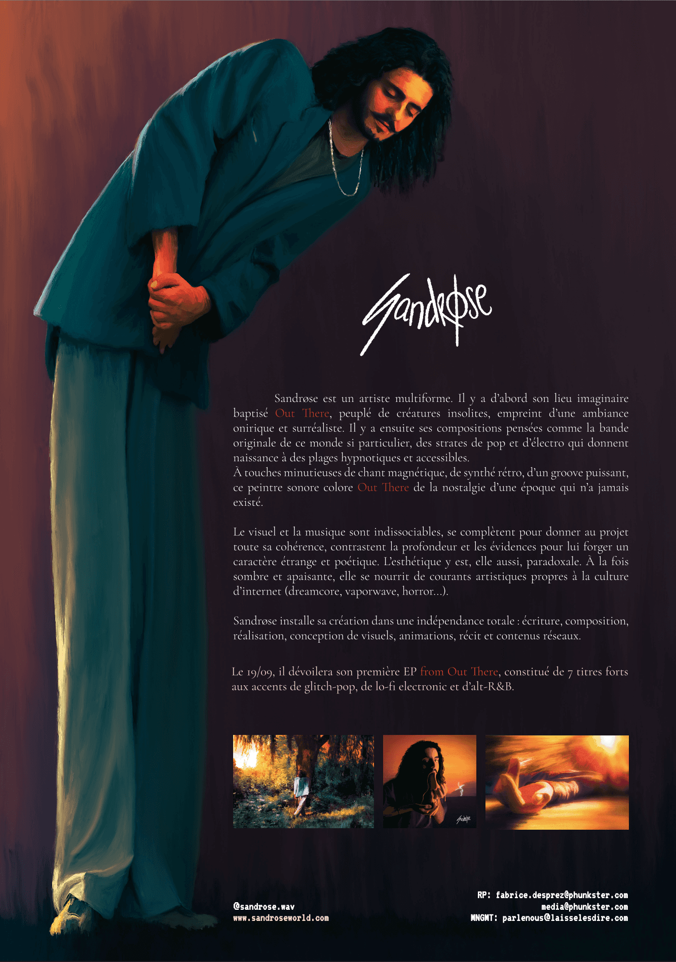
The Linktree (a gateway page between social media and the productions) represented an important challenge. Finding artists' link pages often too generic, I designed a web page true to the artwork's universe, both visually coherent and optimized for navigation and accessibility. The goal: to foster immersion into this universe from the very first click. The same coherence was applied to all visual content related to the projects (festival poster, press release...)
Original handmade merchandising
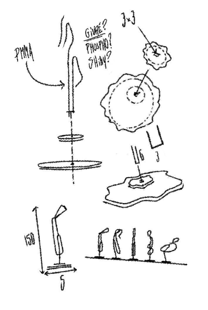
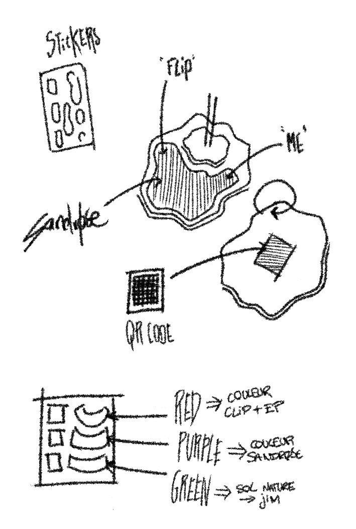
On the occasion of the project's release party, I wanted to celebrate the EP's launch with a merchandising sale. Drawing on my experience as a children's product designer, I hand-crafted a collection of figurines depicting the entities that embody the project's universe. The symbolism of bringing these entities into the real world became an obvious choice, both relevant and meaningful.
Each figurine could be scanned to redirect to the Linktree. Later, social media contests and concepts also allowed members of the community to win them.

sandrosecontact@gmail.com +33 6 37 05 68 39